WELCOME
Connecting with Families at the Maternity, Baby & Kid Expo

Connecting with Families at the Maternity, Baby & Kid Expo

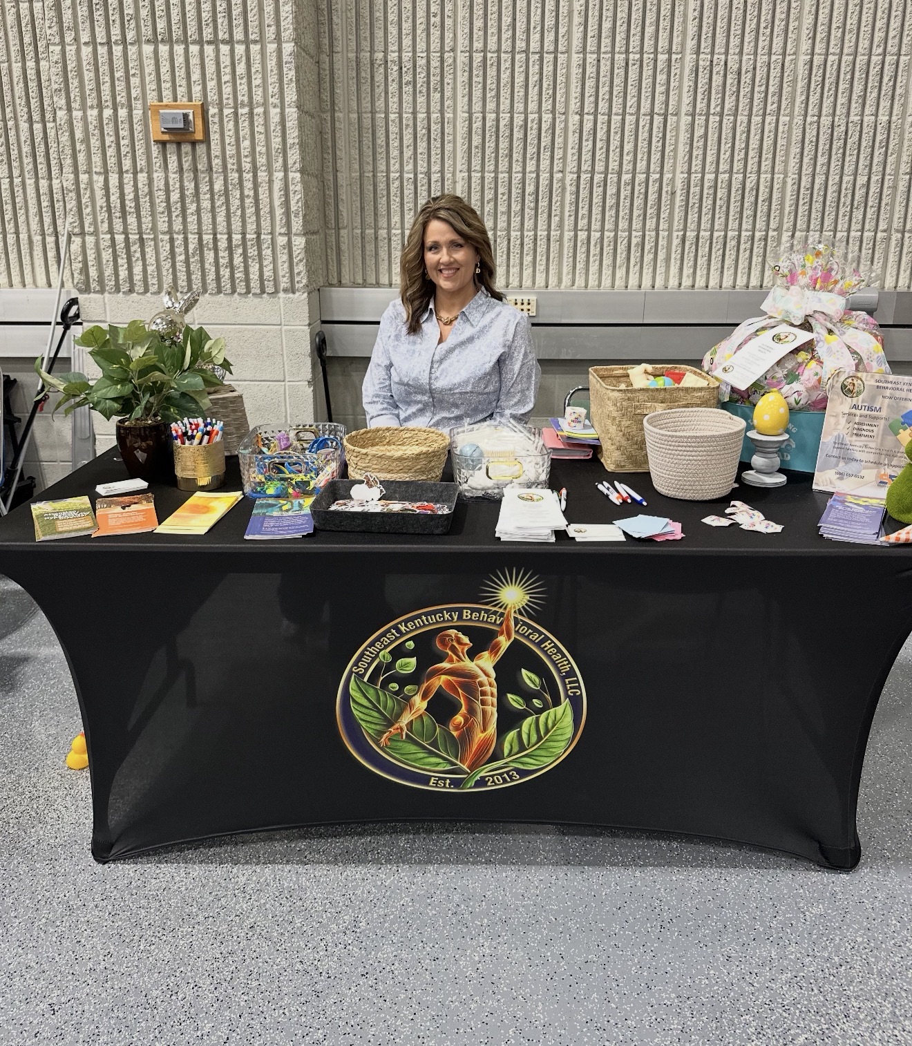
Southeast Kentucky Behavioral Health (SEKYBH) recently had the privilege of participating in the Maternity, Baby & Kid Expo in Somerset, proudly sponsored by Lake Cumberland Regional Hospital on March 25, 2026. This event brought together families from across the community for a day focused on education, support, and connection.

Representing SEKYBH, Sabrina Henson, Case Manager and Marketer, spent the day engaging with parents, caregivers, and children—sharing valuable information about the wide range of behavioral health services available. From early childhood support to family-centered care, the event provided an opportunity to highlight how SEKYBH is committed to meeting families where they are and supporting their unique needs.

Events like this serve as a reminder of the importance of community outreach in building trust and awareness around mental health services. By connecting face-to-face with local families, SEKYBH continues to strengthen its mission of providing compassionate, accessible care throughout Southeast Kentucky.

It was truly a meaningful day filled with conversations, connections, and a shared commitment to supporting the well-being of children and families in the region.

Our Logo has meaning.

Southeast Kentucky Behavioral Health, LLC’s logo symbolically represents behavioral health and well-being through the following elements:

1. Central Figure (Orange Abstract Person): The abstract human figure with outstretched arms symbolizes growth, empowerment, and the achievement of positive behavioral change. It reflects the progress individuals can make in managing and improving their behaviors.

2. Circular Blue Border: The blue circle represents unity, stability, and a sense of completeness, emphasizing the organization’s holistic approach to behavioral health care.

3. Green Leaves: The leaves at the base signify growth, renewal, and the nurturing of healthy behaviors, highlighting the process of transformation and positive change.

4. Stars (Upper Right): The stars represent guidance, aspirations, and achieving milestones, symbolizing the support provided to clients in navigating challenges and fostering behavioral growth.

5. Year Established (2013): Including the year highlights the organization’s experience and dedication to providing quality behavioral health services over time.

6. Overall Color Scheme: The combination of blue (trust and calm), red (energy and passion), and green (healing and renewal) reinforces the focus on promoting behavioral health, positive change, and well-being.

This design conveys the organization’s mission to support individuals in achieving healthier behaviors and improving their overall quality of life.